Client
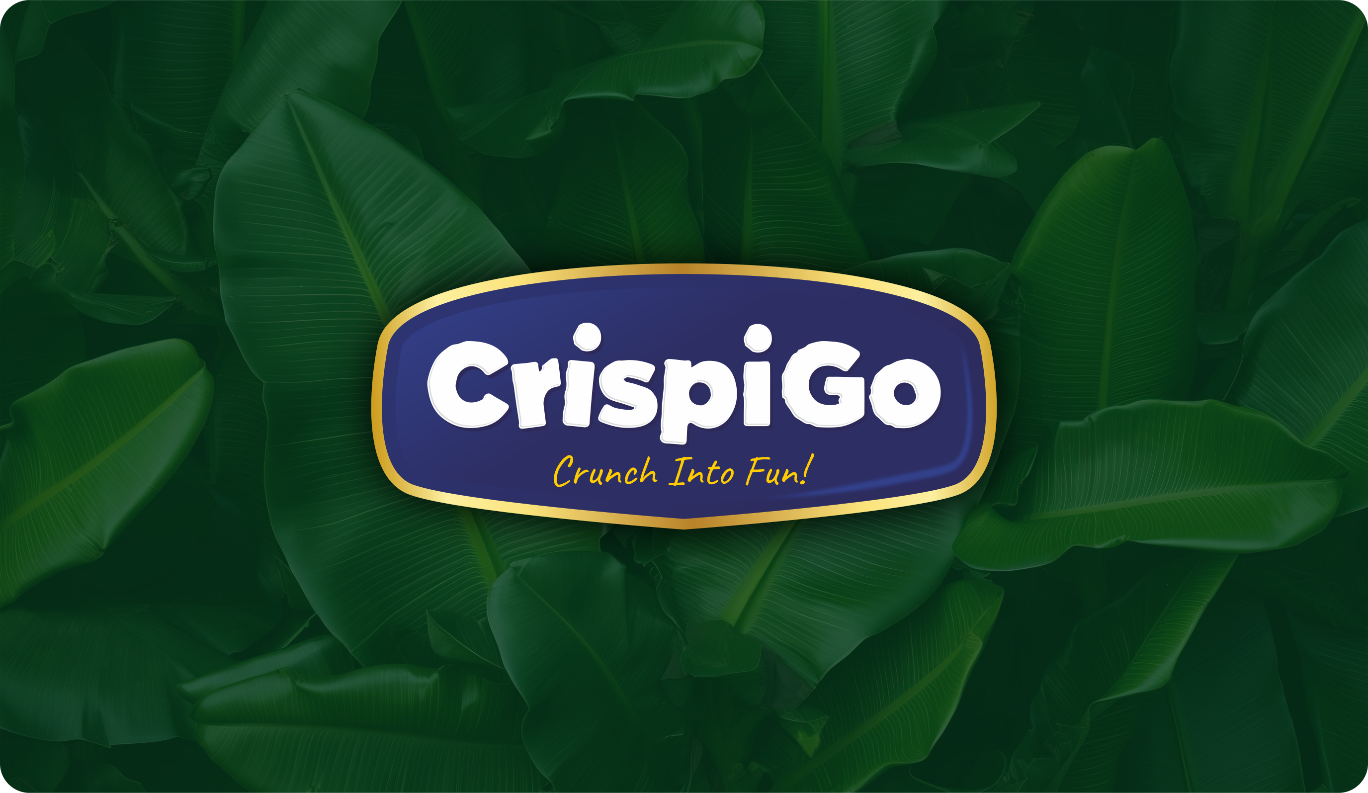
CrispiGo™
A banana-chip brand with one job — to be the most fun thing on the shelf. A bold badge wordmark, a gold-trimmed identity, and packaging engineered to crunch through the noise of the snack aisle. Crunch into fun.
CrispiGo brings Jalgaon banana chips to a national audience. The brief: stand out in a crowded, price-led aisle without looking cheap or generic.
We anchored the brand in a confident badge wordmark that works as a stamp of quality and a piece of play.
The position balances trust and joy — gluten-free, no added preservatives, rich in fibre — wrapped in a tone that is energetic, youthful, and unmistakably fun.
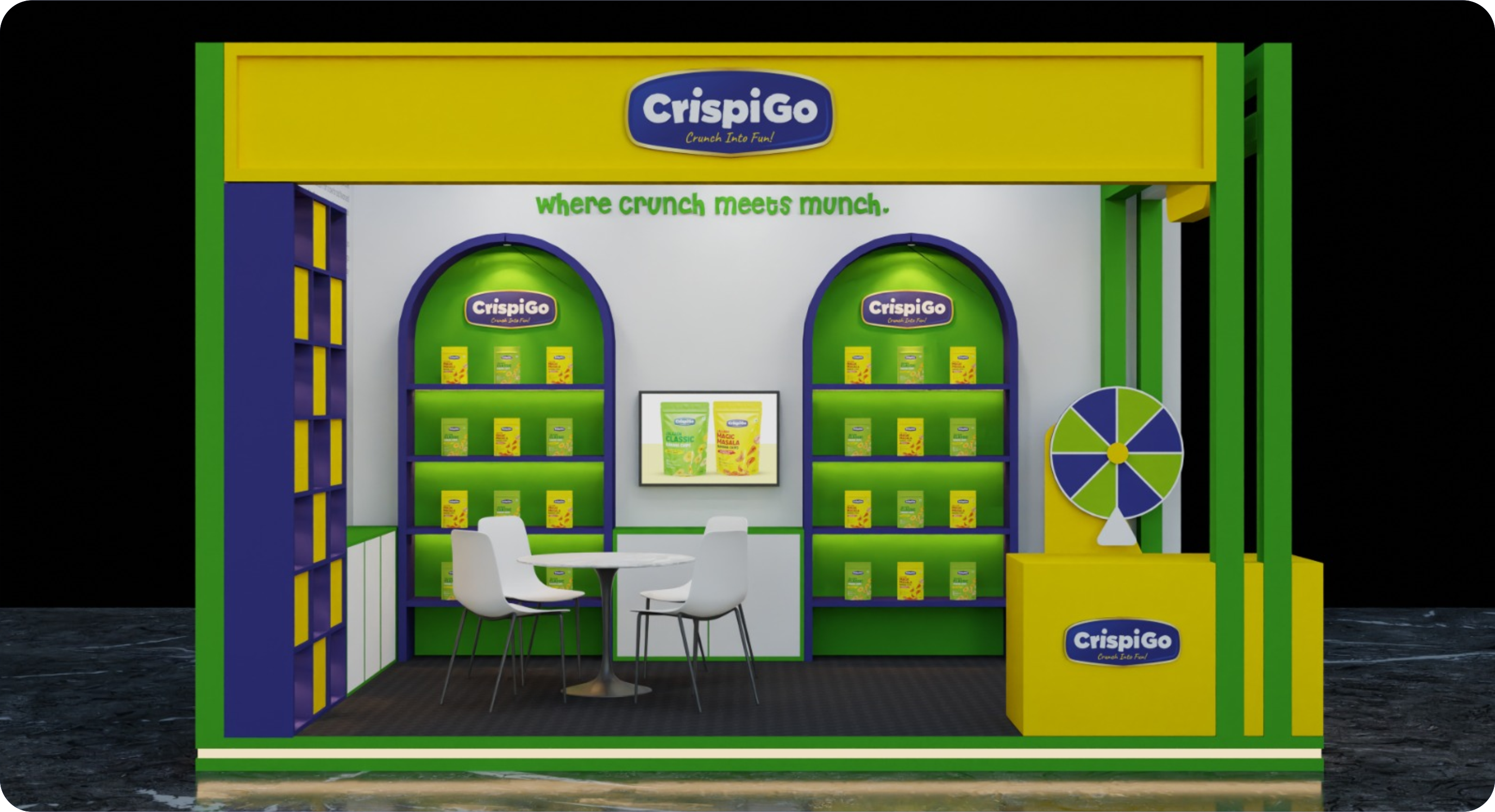
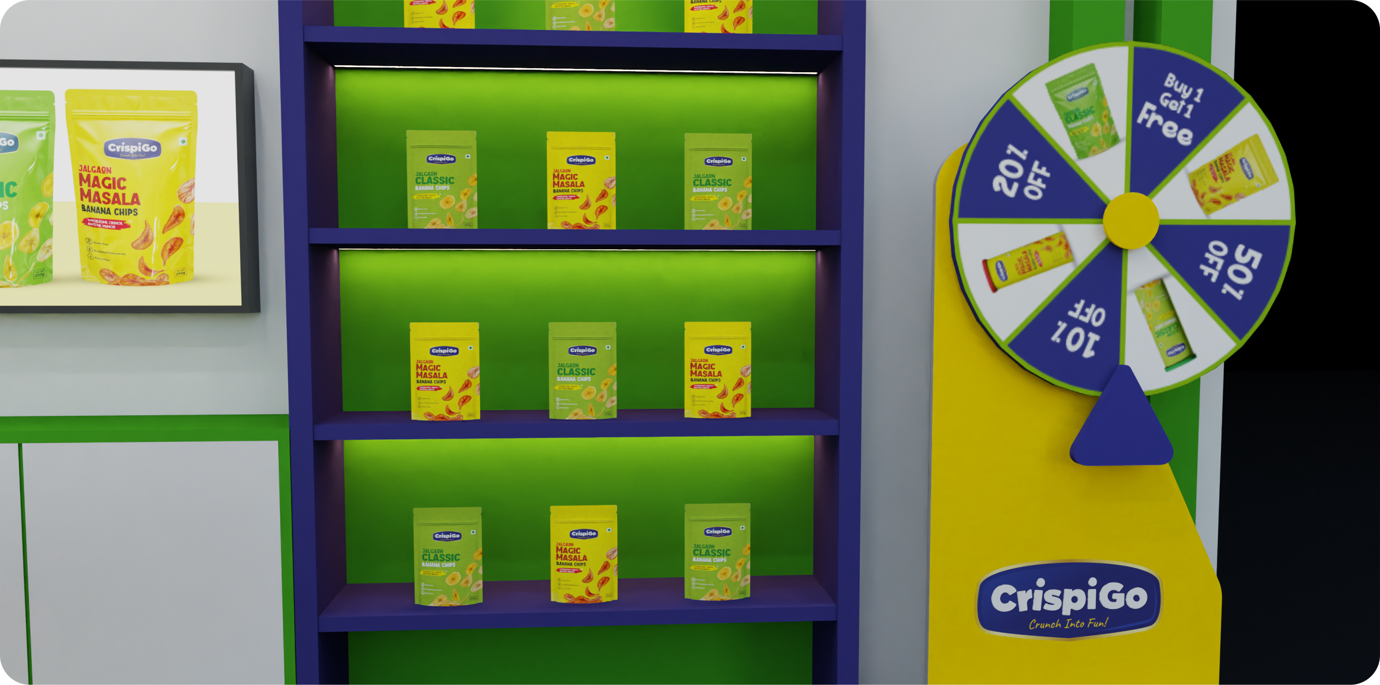
Quality you can feel good about, packaging you can’t walk past.
A deep royal-blue badge with a gold border signals premium; chunky, slightly irregular white letters with a 3D pop bring the crunch and the play.
Flavour-coded packs — green for Classic, yellow for Magic Masala — make the range instantly scannable.
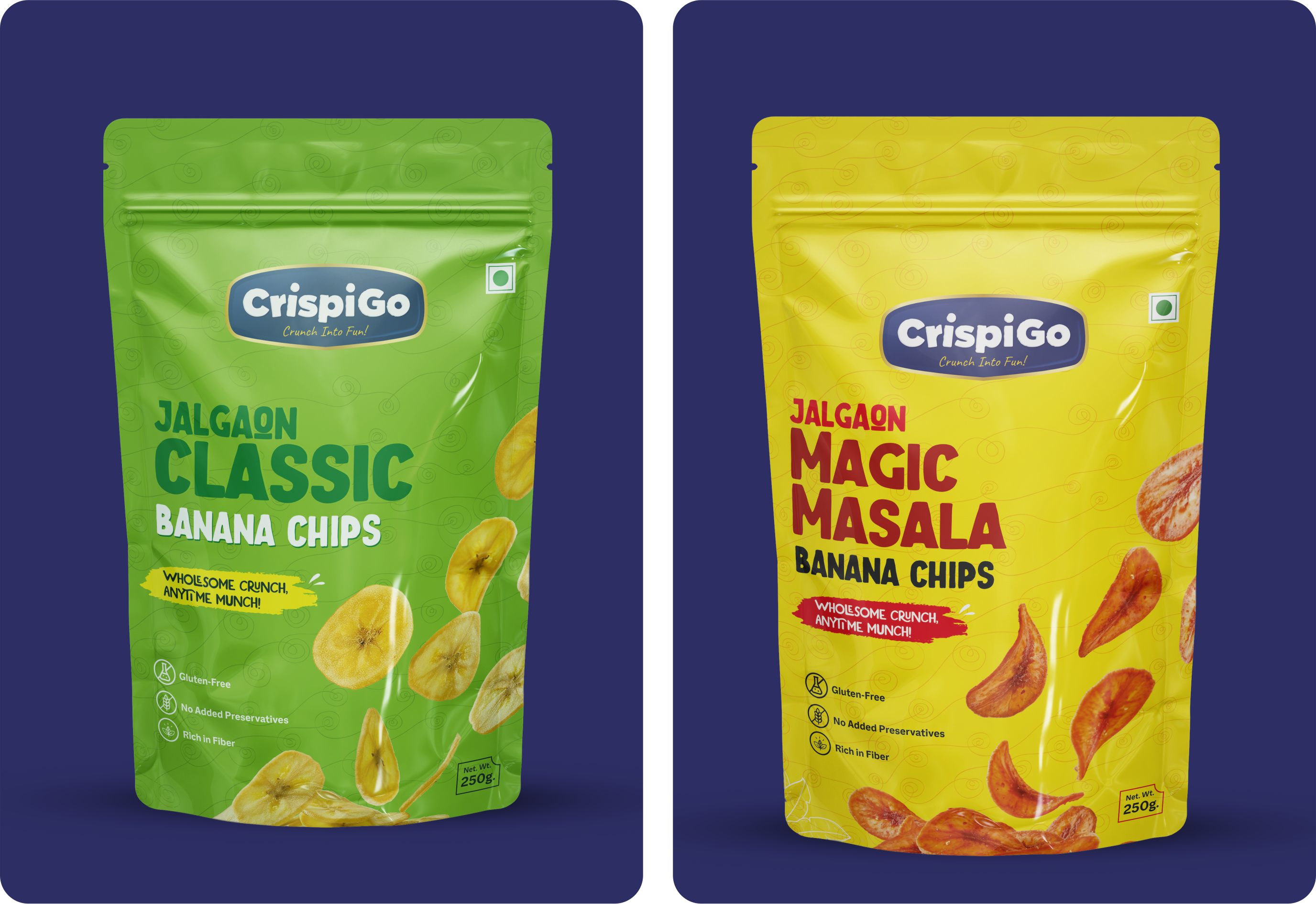
Each pack leads with a big flavour name and a colour the eye locks onto from across the aisle, while the badge keeps the family unmistakably together.
Appetite cues — real chips, warm light — do the selling; the system stays clean around them.
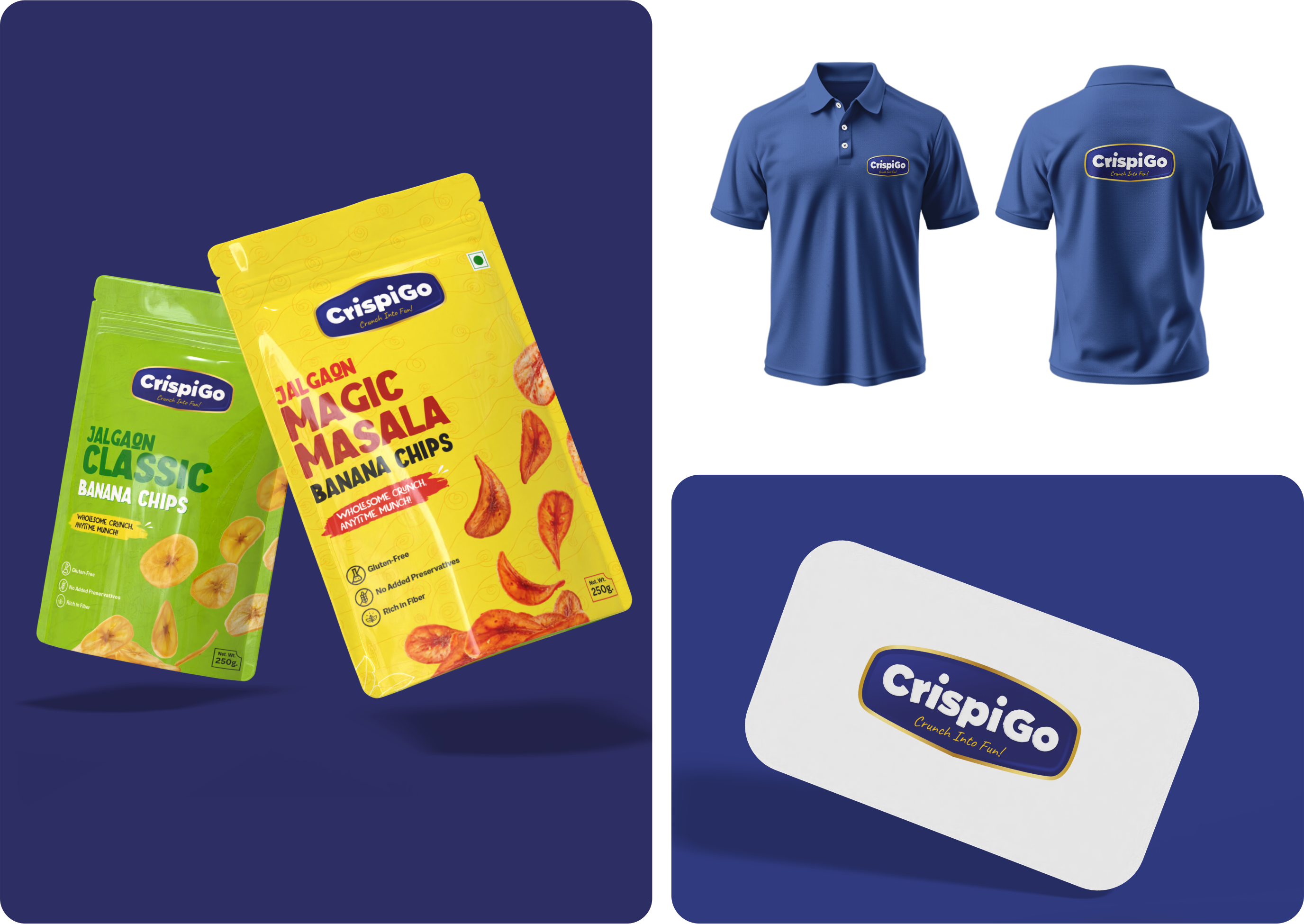
From polos to business cards, the badge holds its presence at any size. The identity is built to dress a team, a stall, and a delivery just as confidently as a pack.
Consistent, ownable, and ready to scale beyond a single flavour line.
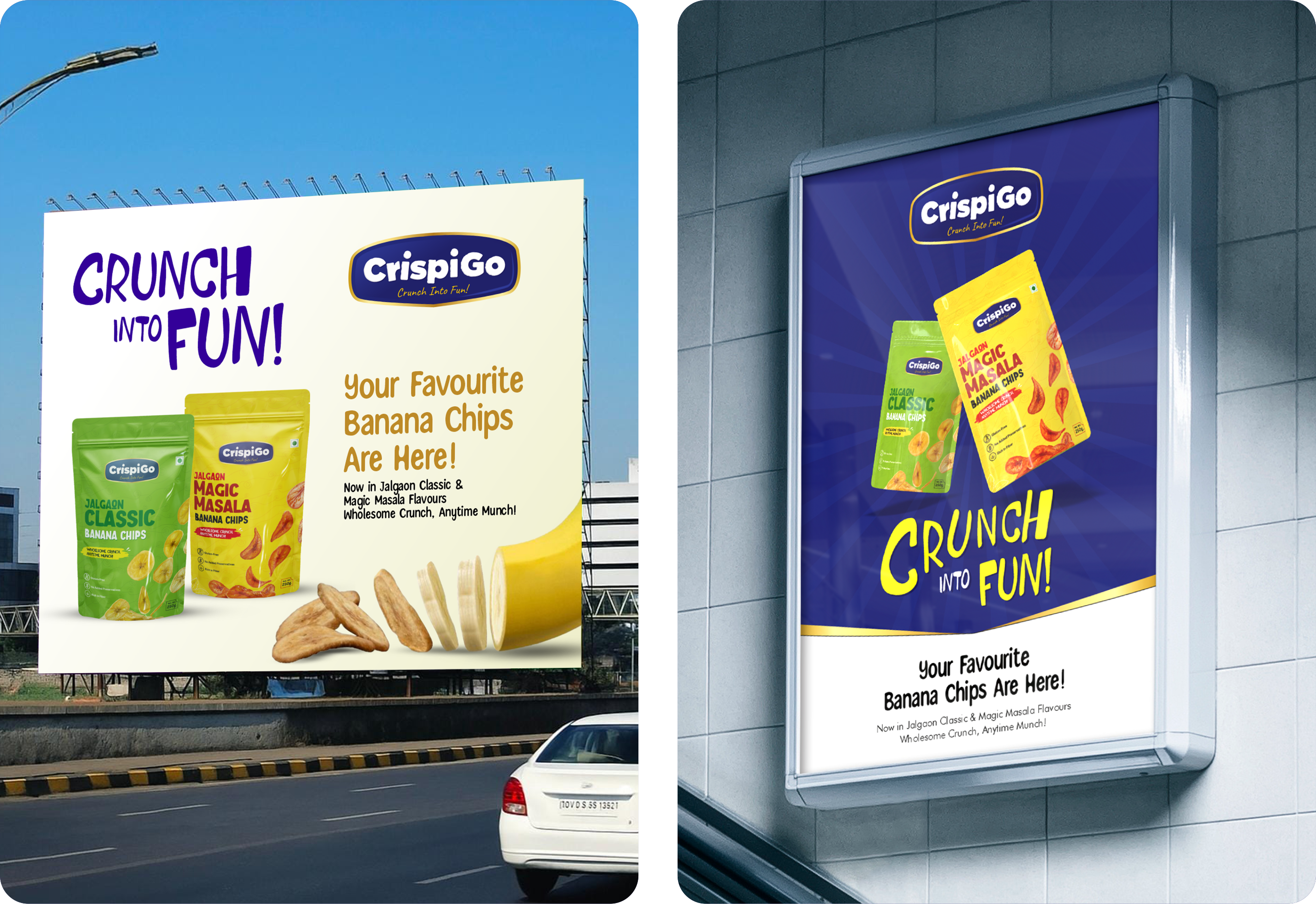
A great snack brand makes you smile before you taste it. CrispiGo had to win on the shelf, in one glance.