Client
Sans Spirit
A modern non-alcoholic beverage envisioned as a confident alternative to traditional alcoholic and sugary drinks. Premium, visually striking, and socially magnetic, without leaning on familiar mocktail clichés.
Sans Spirit was envisioned for a generation choosing differently. Not a wellness product, not a substitute, but a beverage with its own social weight. The objective was to create a brand that felt premium and visually striking from first glance.
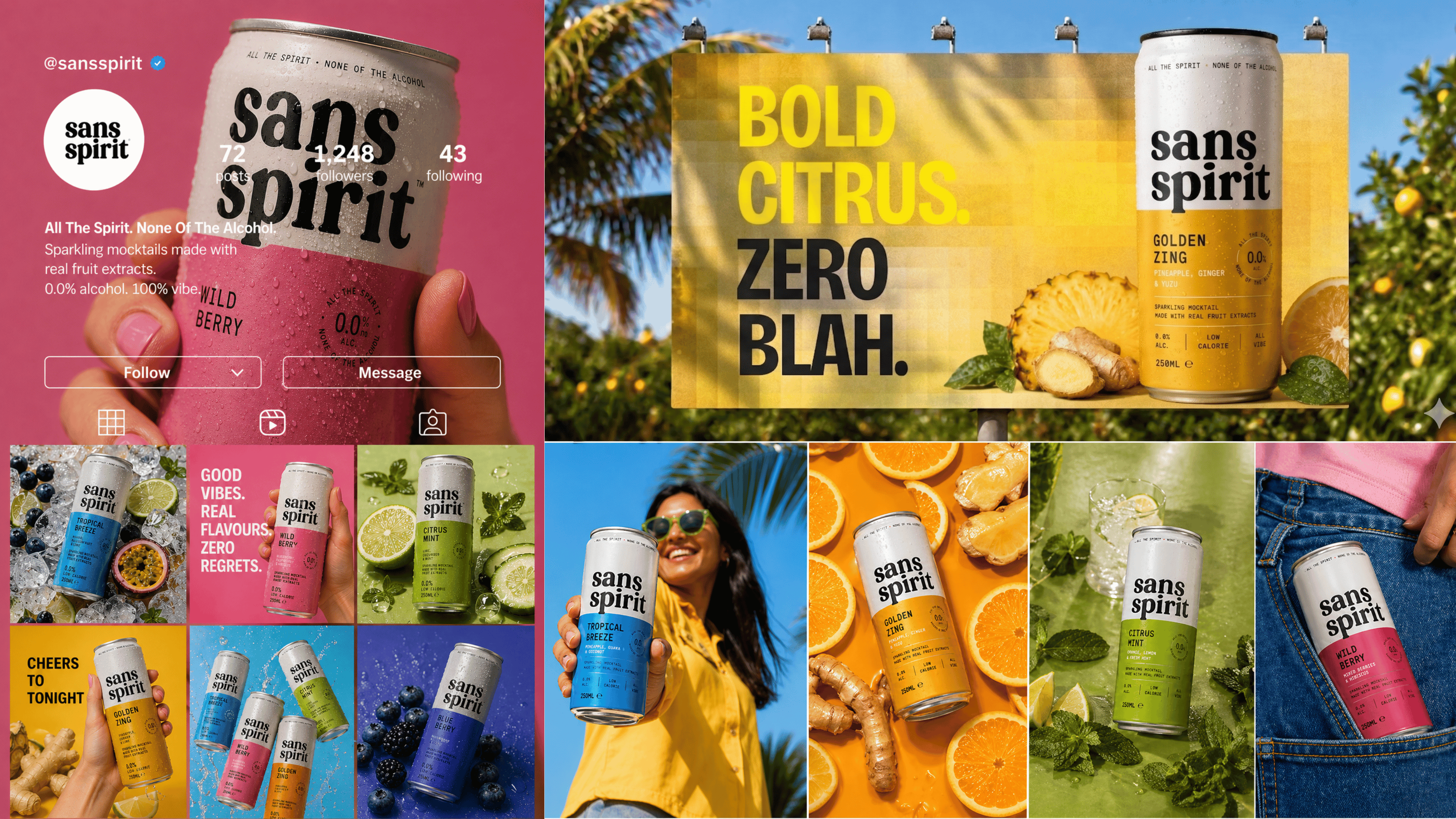
Every touchpoint was approached with consistency, from product visuals to digital storytelling.
Rather than competing on health credentials, the position is cultural. Sans Spirit belongs at the same table as the spirits it stands apart from. Confidence, ritual, and connection sit at the centre of the brand’s tone.
The result is a beverage identity that feels contemporary and naturally positioned within modern social moments.
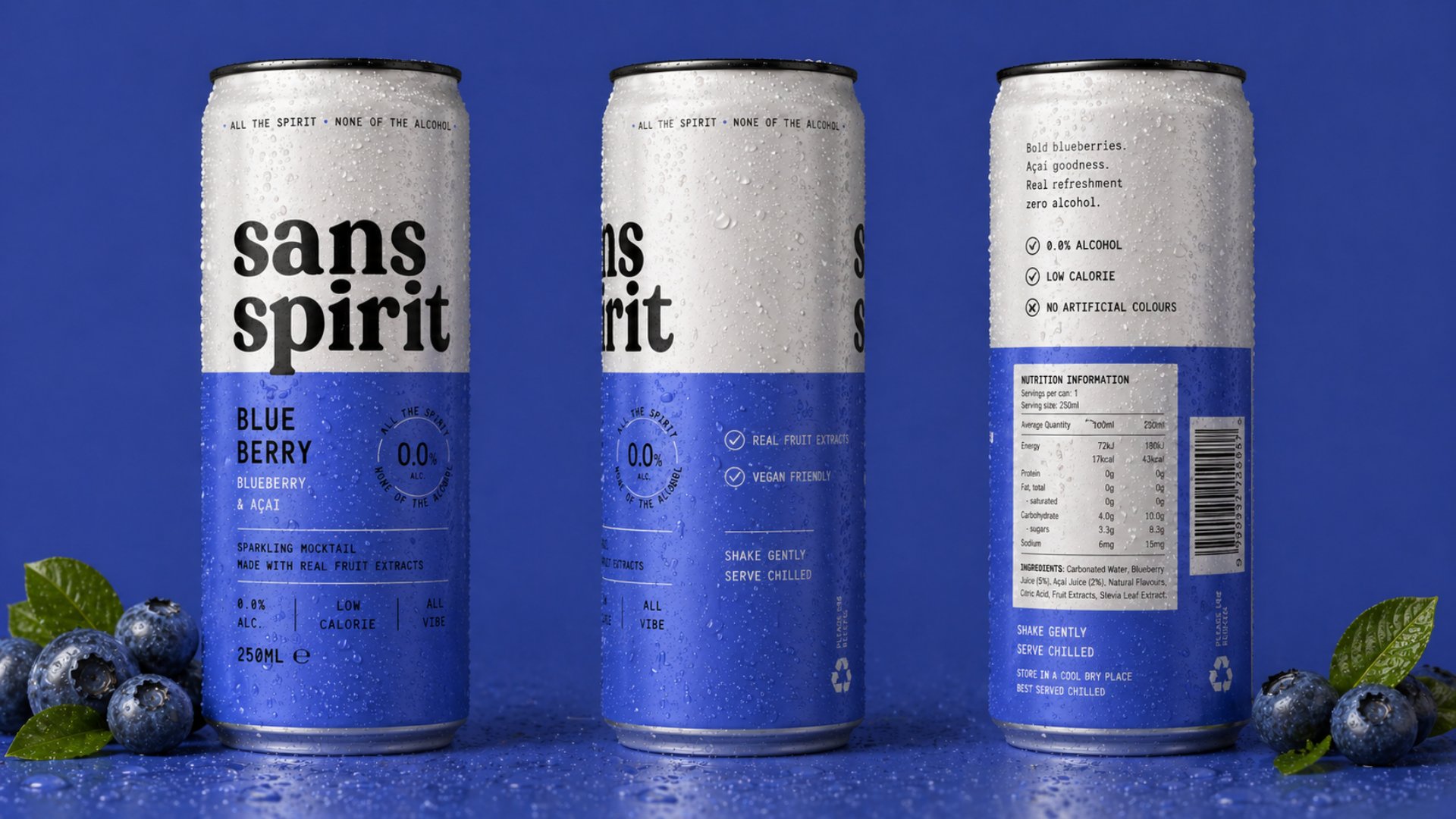
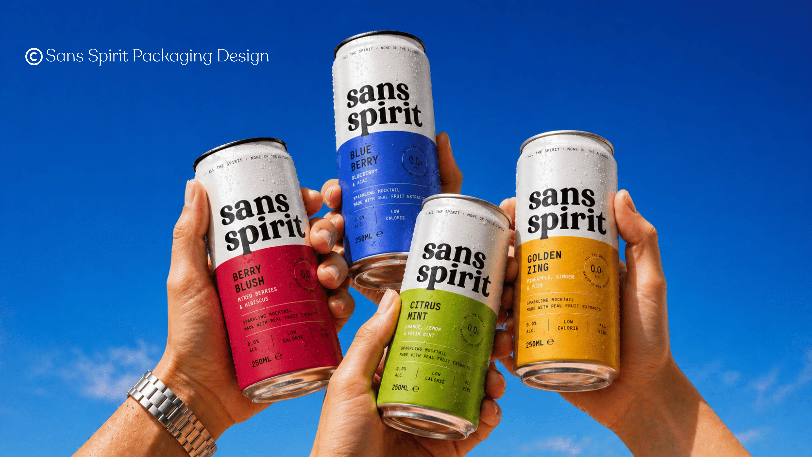
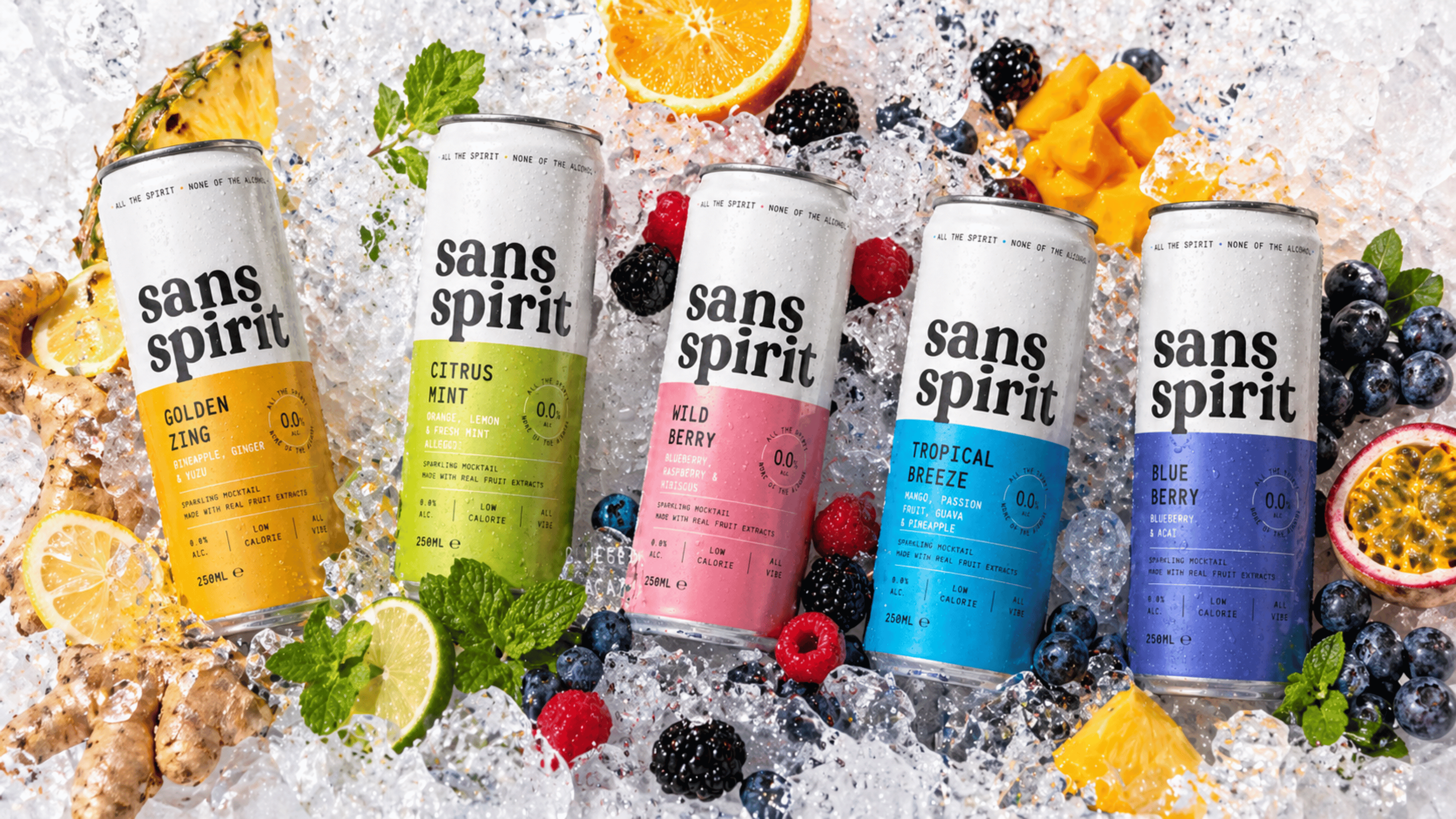
The creative direction balances clean structure with bursts of vibrant colour. Packaging is engineered to feel instantly recognisable and considered, with typography that holds restraint and a palette that reads boldly across formats.
Campaign imagery focuses on elevated everyday moments. Lifestyle, confidence, and quiet ritual.
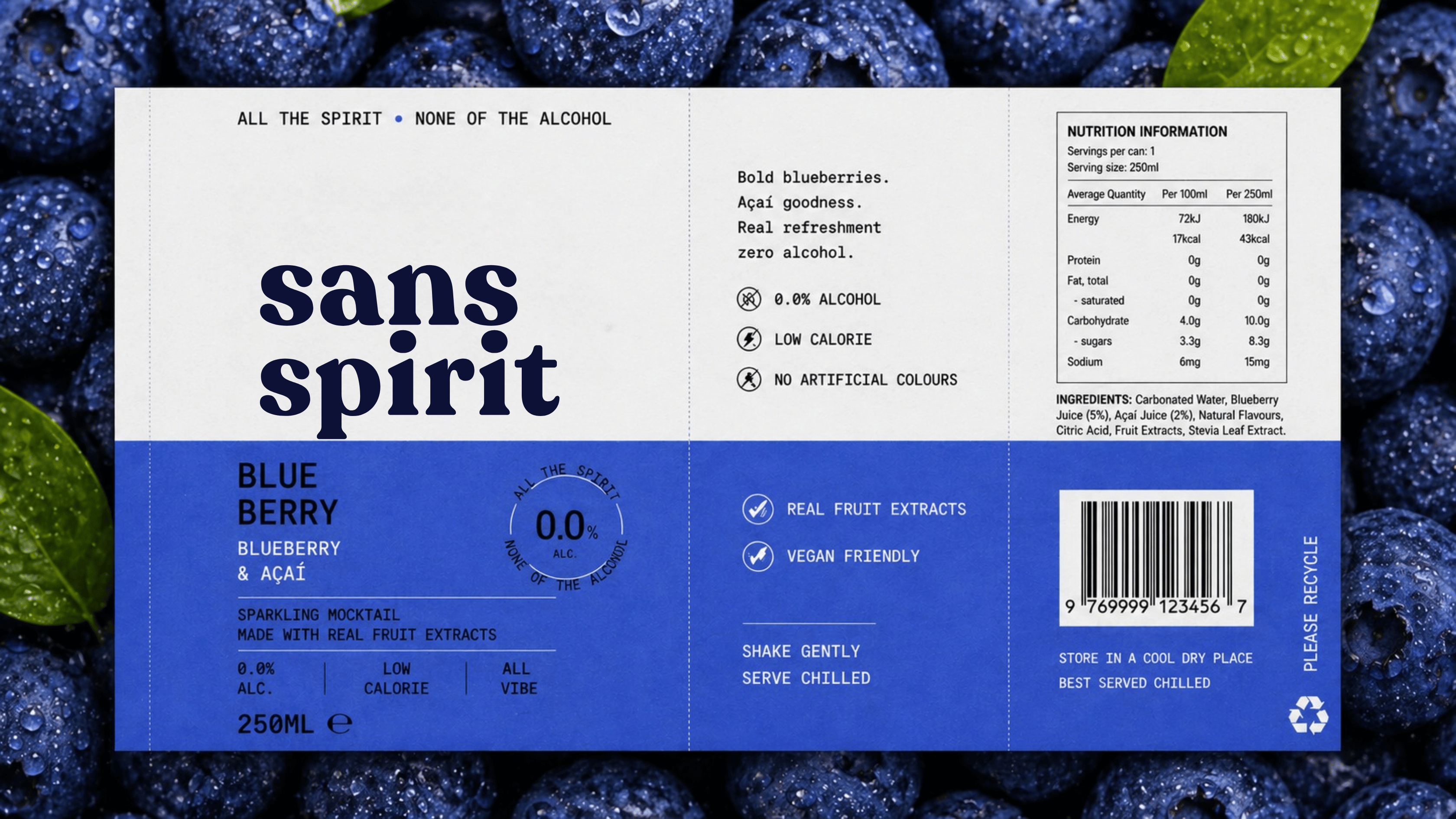
The bottle was engineered to feel like a grown-up product. A serif workhorse anchors the wordmark, label architecture is precise around the bottle’s curvature, and material choices read tactile rather than novelty.
No icon, no influencer surface, no caption. The label earns the bottle, and the bottle earns the shelf.
Photography is interior, plated, and low-light. Sound design for launch films leans on silence and ice. The campaign positioned the brand against an atmosphere rather than a single occasion, which gave the work a longer cultural lifespan than a typical product launch.
The visuals belong as easily on a press feature as on a tasting menu.
The brief was to feel premium without permission. Sans Spirit could sit on any table and earn its place.