Client
Uncapped™
A contemporary outdoor apparel brand designed for a new generation of explorers. Built around freedom, movement, and self expression, with a clean modern visual language that feels equally grounded in nature and in everyday urban life.
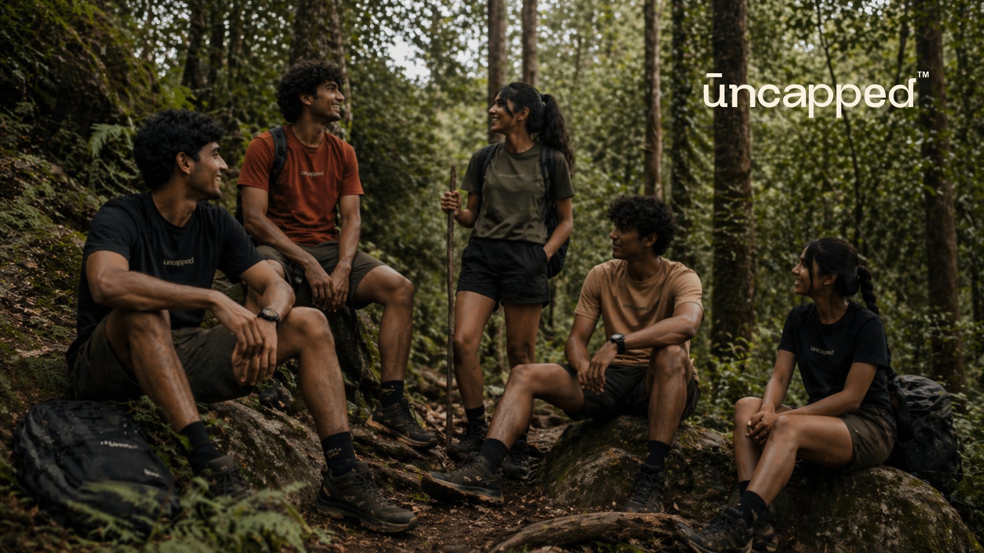
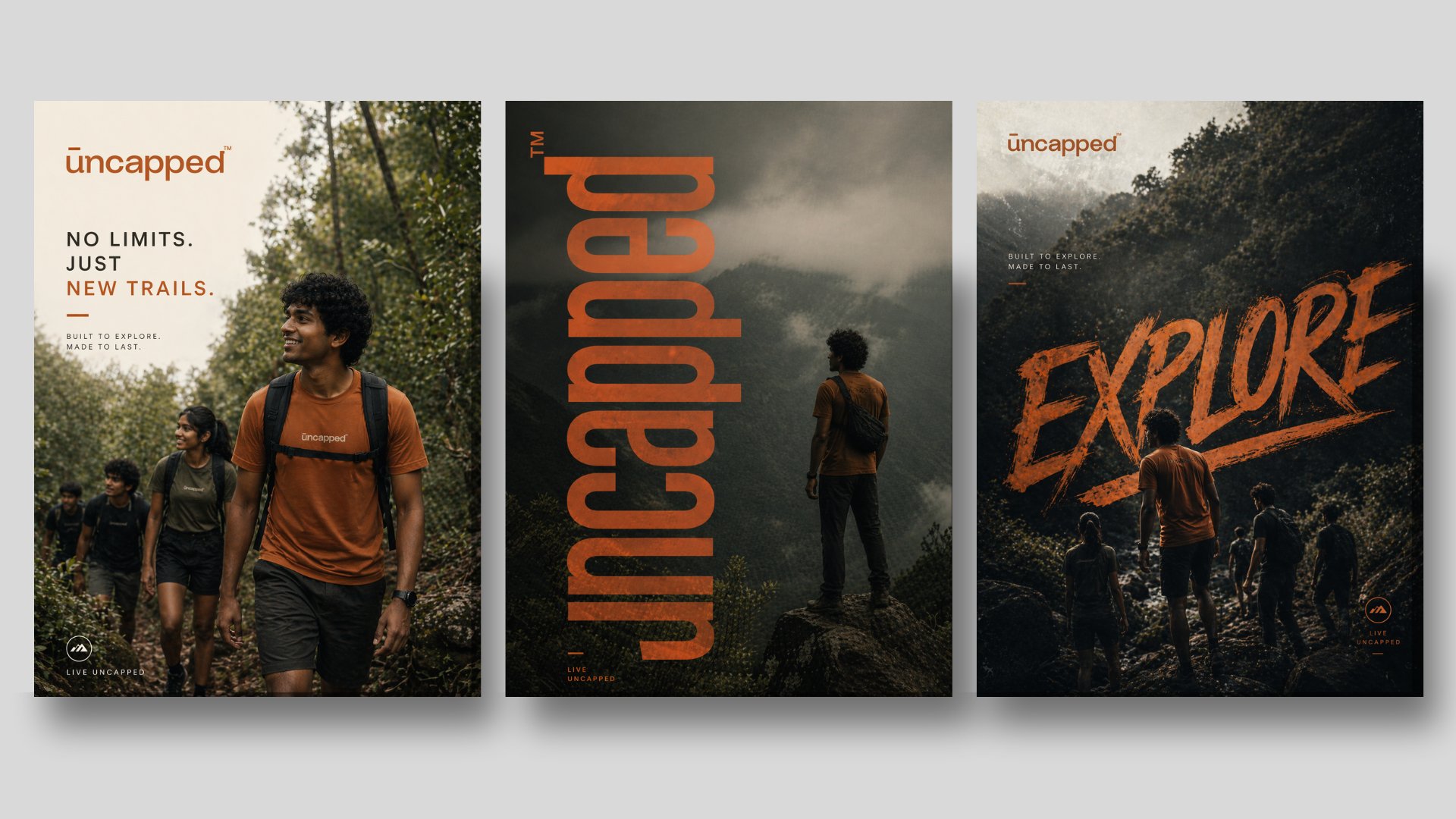
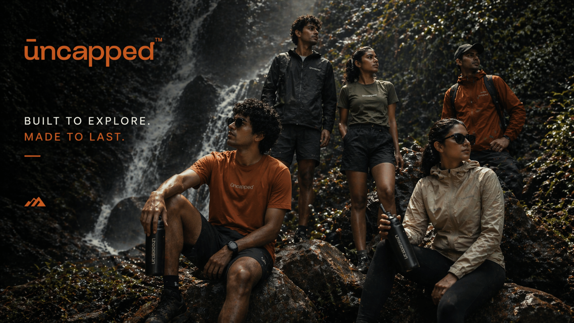
Uncapped was created for a generation that treats the outdoors as a way of being, not a costume to wear on the weekend. The brand is built around trekking and performance, but the visual language reaches further than the category usually does.
Rather than positioning outdoor wear as purely technical, the direction focuses on a brand that feels equally relevant in nature and in everyday urban life.
The identity draws from open terrain, calm motion, and the personal rituals that come with spending time outside. The position is not adventure as performance. It is presence, with the gear and the language that supports it.
Everything is engineered so the products carry presence naturally, without the brand needing to shout around them.
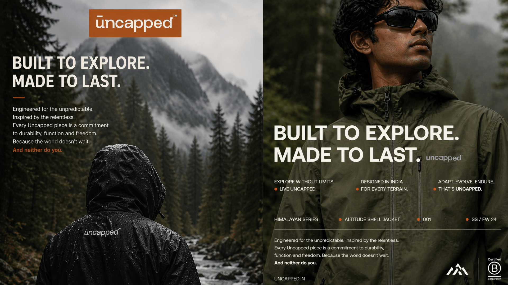
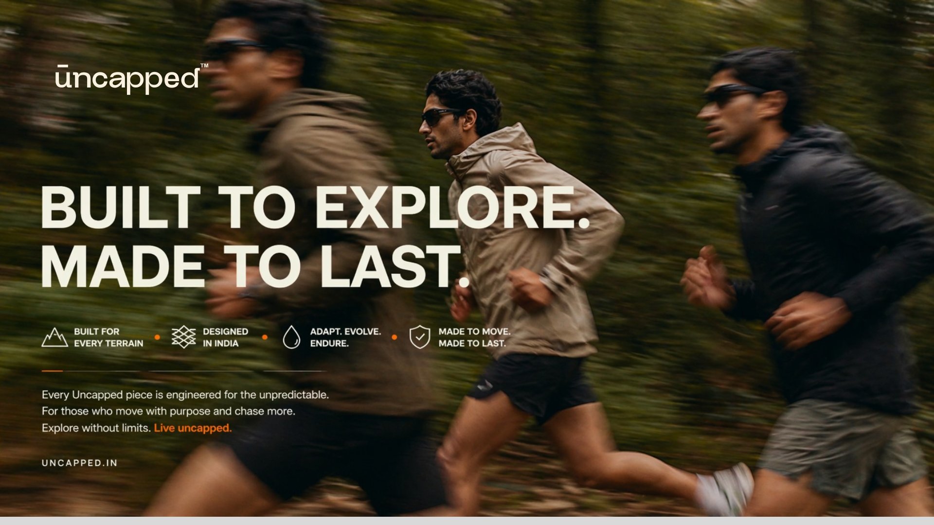
Earth-toned palettes, minimal layouts, and a confident type system bring clarity to the brand and let the products lead. A workhorse display face anchors campaign communication, a clean text face carries product detail.
Photography traded studio gloss for terrain and weather. Real garments, real light, real conditions.
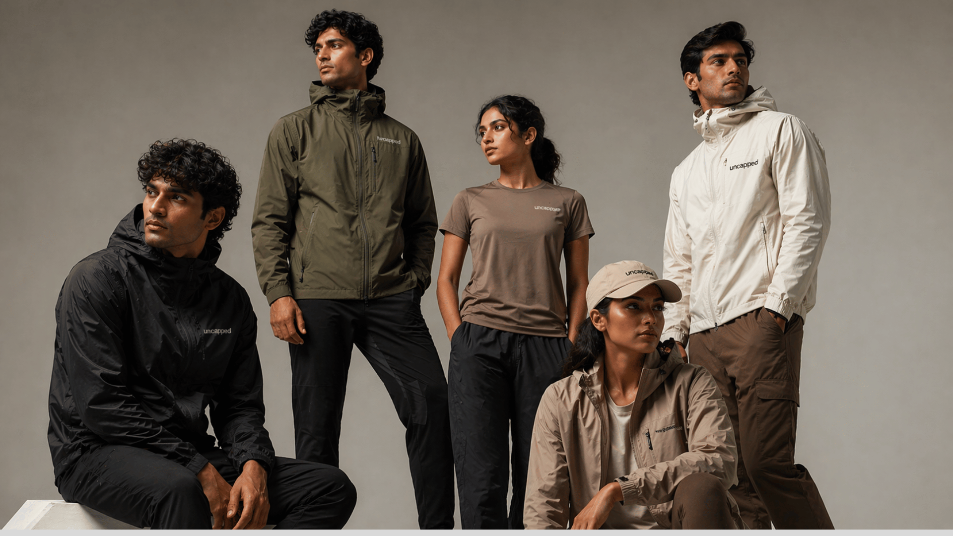
The system is restrained on purpose. Type pairs are short, layouts hold large negative space, and every supporting element steps back so the garments can read clearly across campaign, retail, and editorial.
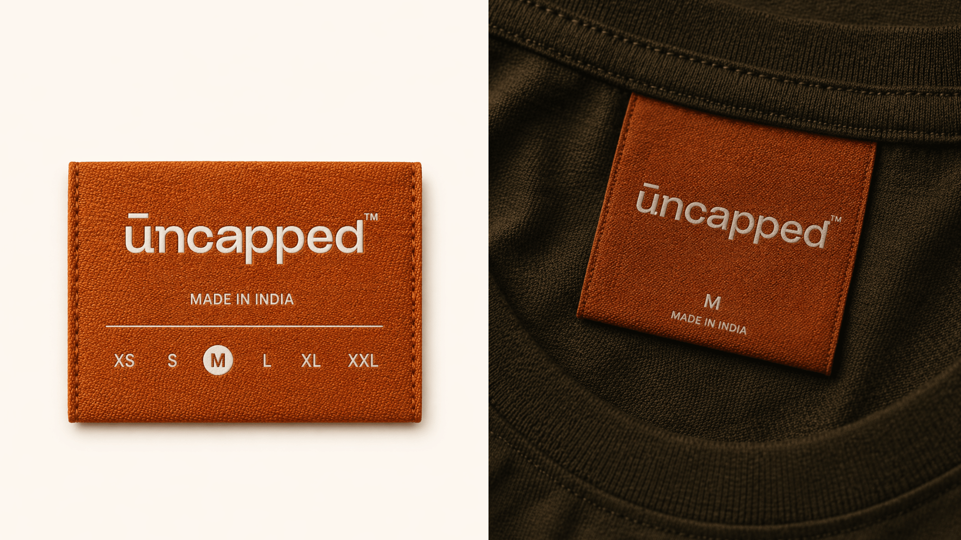
Woven labels, care tags, and packaging extend the same restraint into the hand. The first physical contact with the brand should feel as considered as the campaign.
The campaign is shot for grain and texture, not gloss. The aim was to build a visual record that felt authentic to the way the audience actually spends time outside, with imagery that holds up at a billboard scale as well as in feed.
Editorial photography, considered art direction, and a unified colour grade tie the work into a single brand world.
Outdoor doesn’t have to be a costume. The brief was to build a brand that feels like a way of moving, not a uniform.