Client
Fresh Greens
A modern healthy food brand created to make clean eating feel effortless and consistent. Built around convenience, clarity, and a fresh yet premium tone for people balancing busy schedules with wellness-focused habits.
The objective was to reposition healthy eating from a routine obligation into a seamless part of everyday life. Convenience, clarity, and trust were the guiding principles across the entire system.
Rather than treating the brand as a simple food service, the approach focused on building a complete lifestyle system.
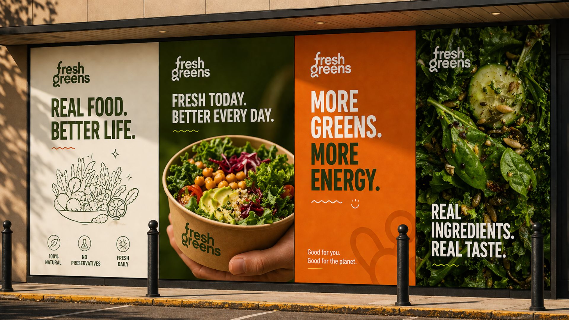
The position avoids the wellness-clinic register and the bright-bowl shorthand. Instead, the brand sits as a quiet, premium fixture, with a tone that simplifies decision making and reinforces consistency.
It rewards repeat behaviour rather than first-time excitement.
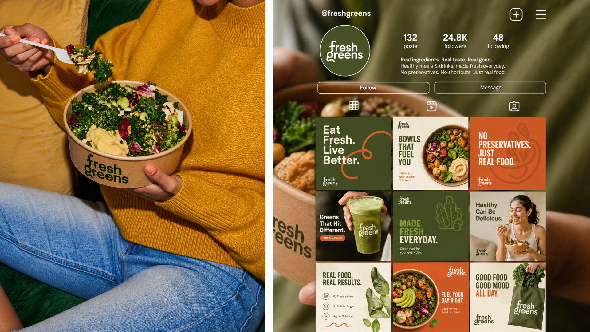
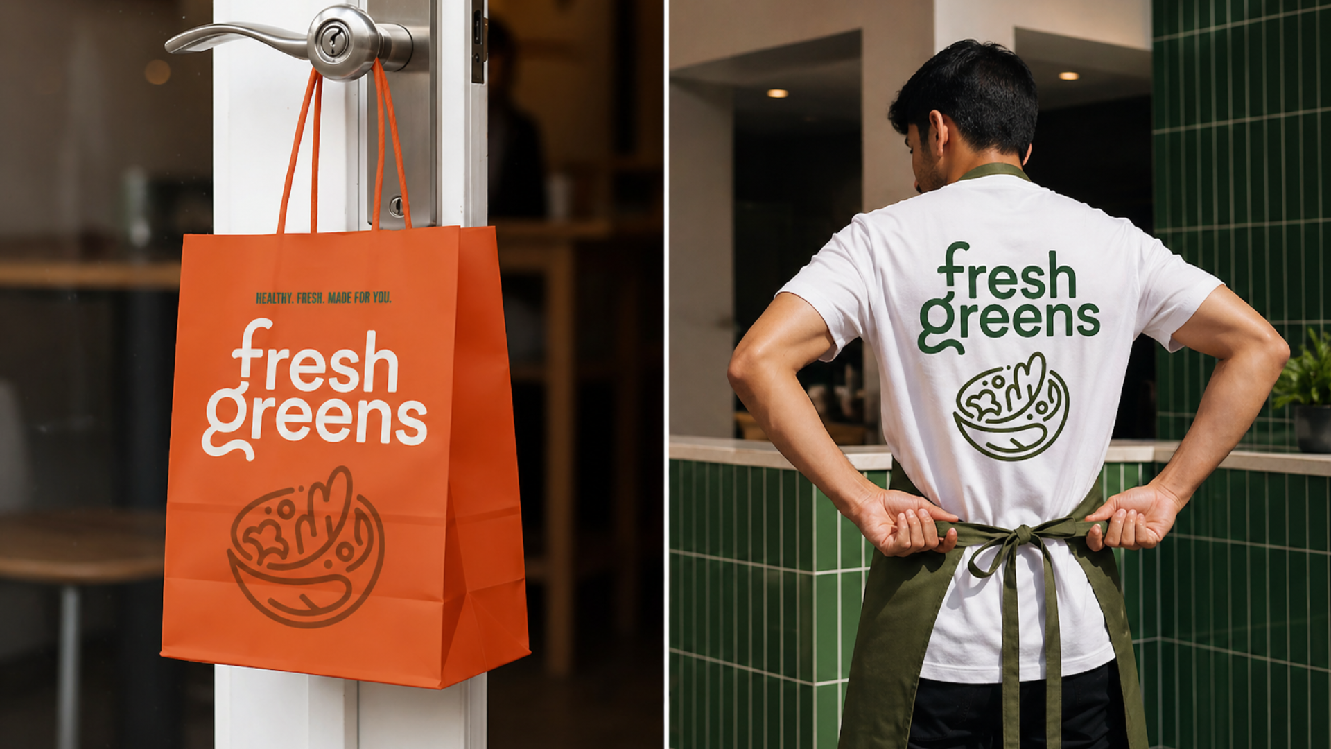
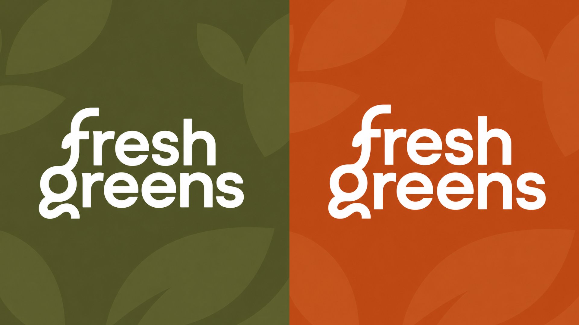
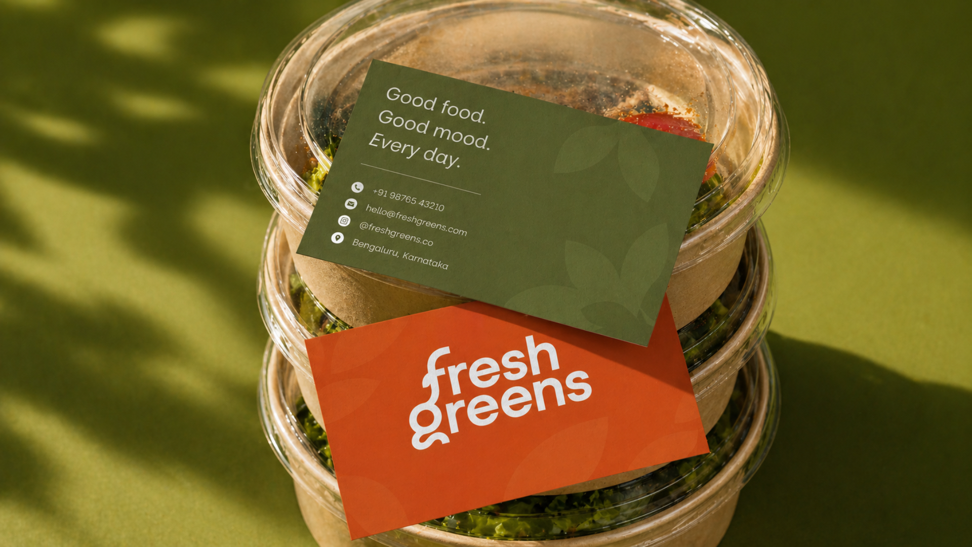
Clean layouts, restrained type pairing, and a fresh palette anchor the system. Photography focuses on the food itself, with backdrops engineered to crop cleanly across packaging, posters, and digital surfaces.
Every touchpoint was designed to simplify decision-making while reinforcing trust, freshness, and ease.
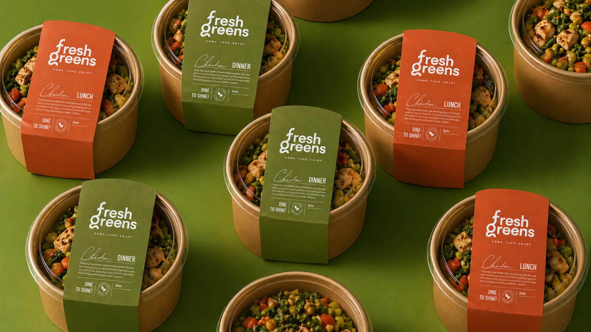
Sleeves wrap, labels crop cleanly, and the bowl itself becomes the hero of every campaign frame. The packaging system was engineered around the visual rhythm of the brand, not the other way around.
Functional considerations and editorial direction were briefed in the same room, so neither pulled the other off-position.
The communication system is short on copy and long on consistency. Posters, sleeves, social, and storefront work together with a shared rhythm of typography, image, and pace.
The result reads as a complete lifestyle world rather than a sequence of marketing assets.
The brief was effortless consistency. We treated wellness as a habit, not a headline.