Client
Beany
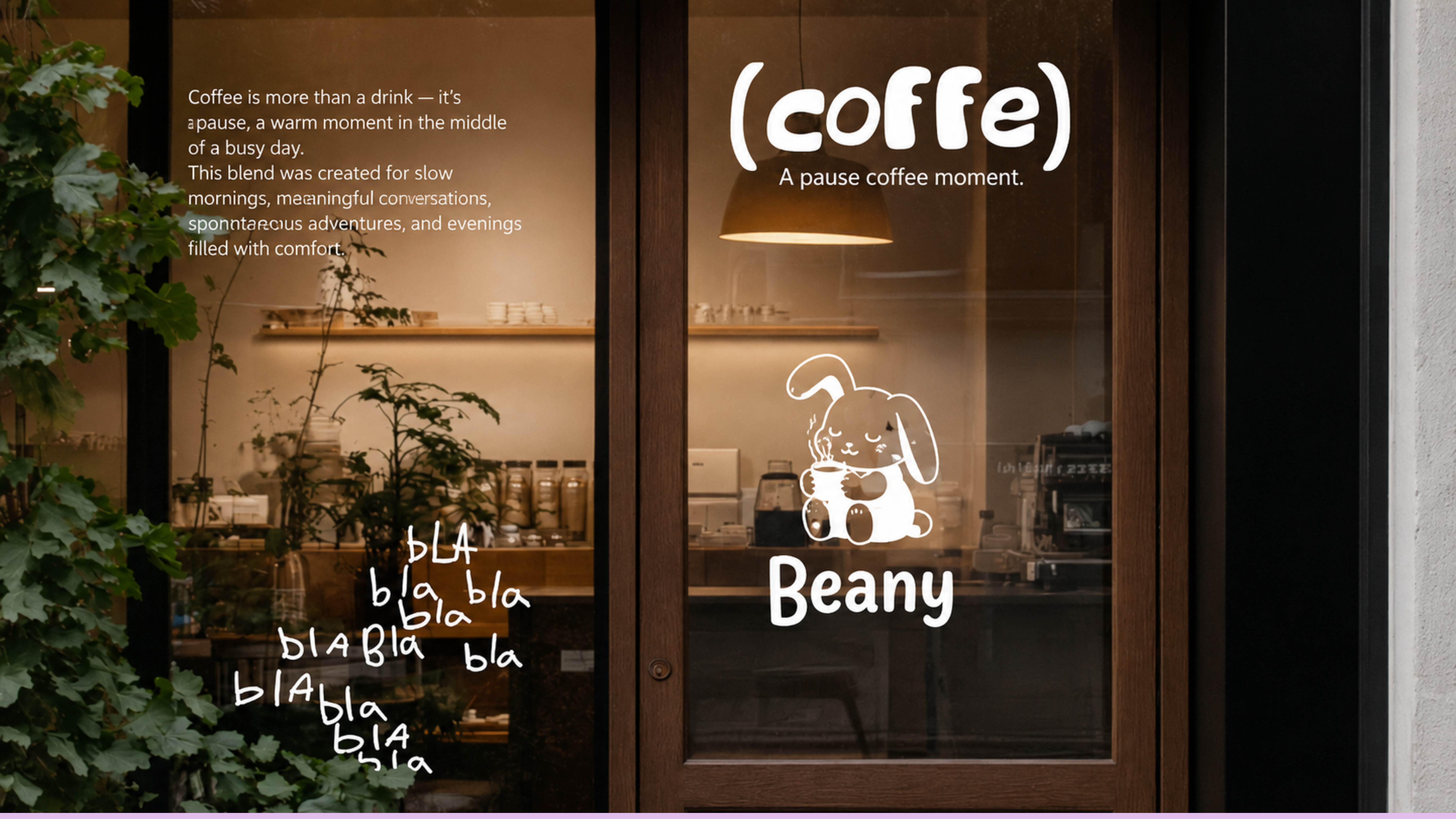
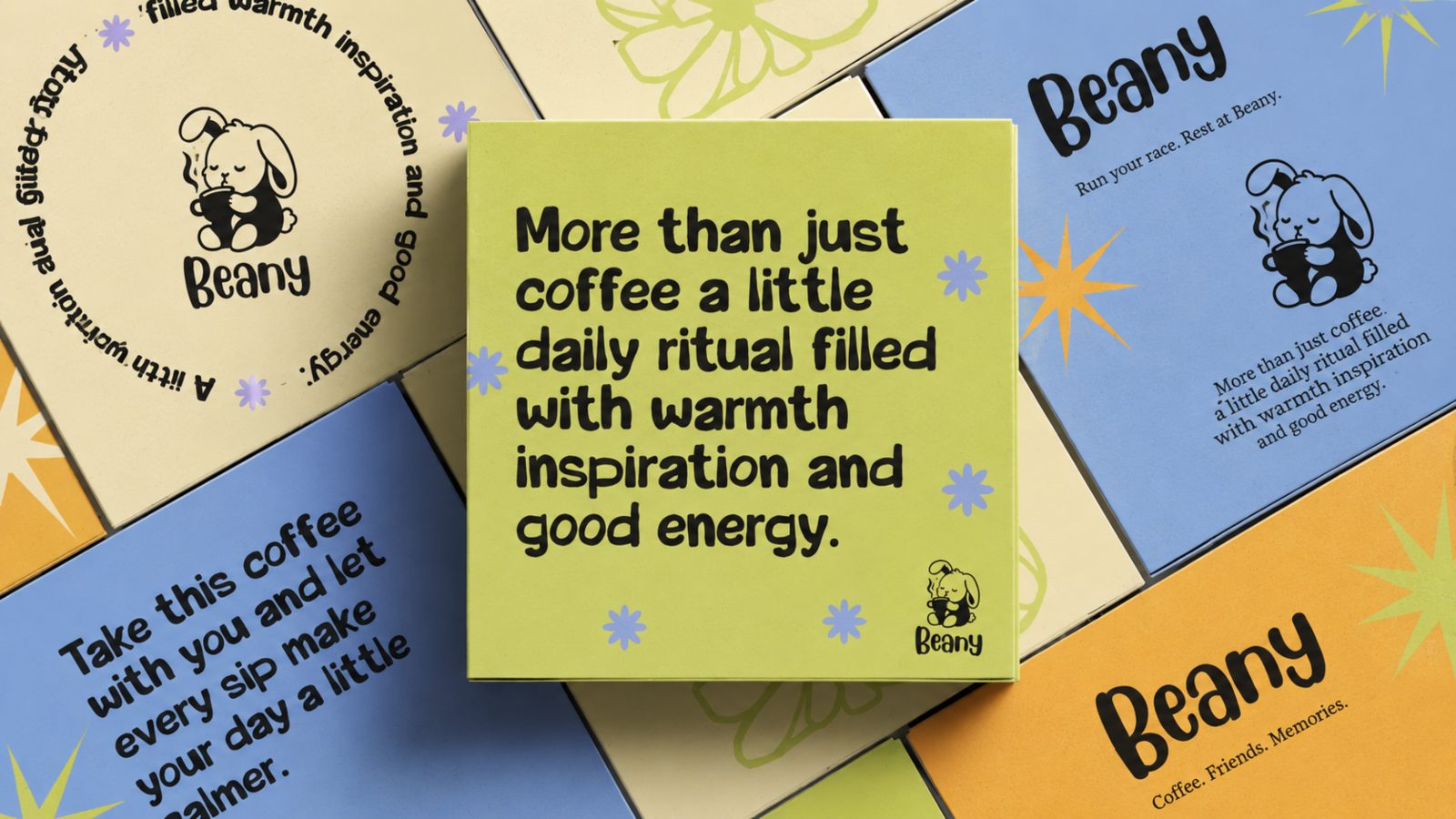
A coffee brand built on a simple idea: everyone is running their own race, and sometimes all you need is a pause. Run your race. Rest at Beany.
Most people remember the rabbit for stopping mid-race. We saw the opposite. The rabbit understood that rest is part of the journey, not a failure in it.
That became the whole brand. Beany is the pause in a busy day, the small reason to slow down and start again with more in the tank.
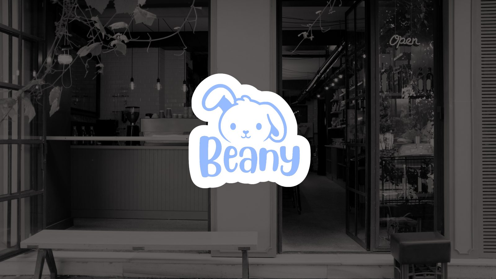
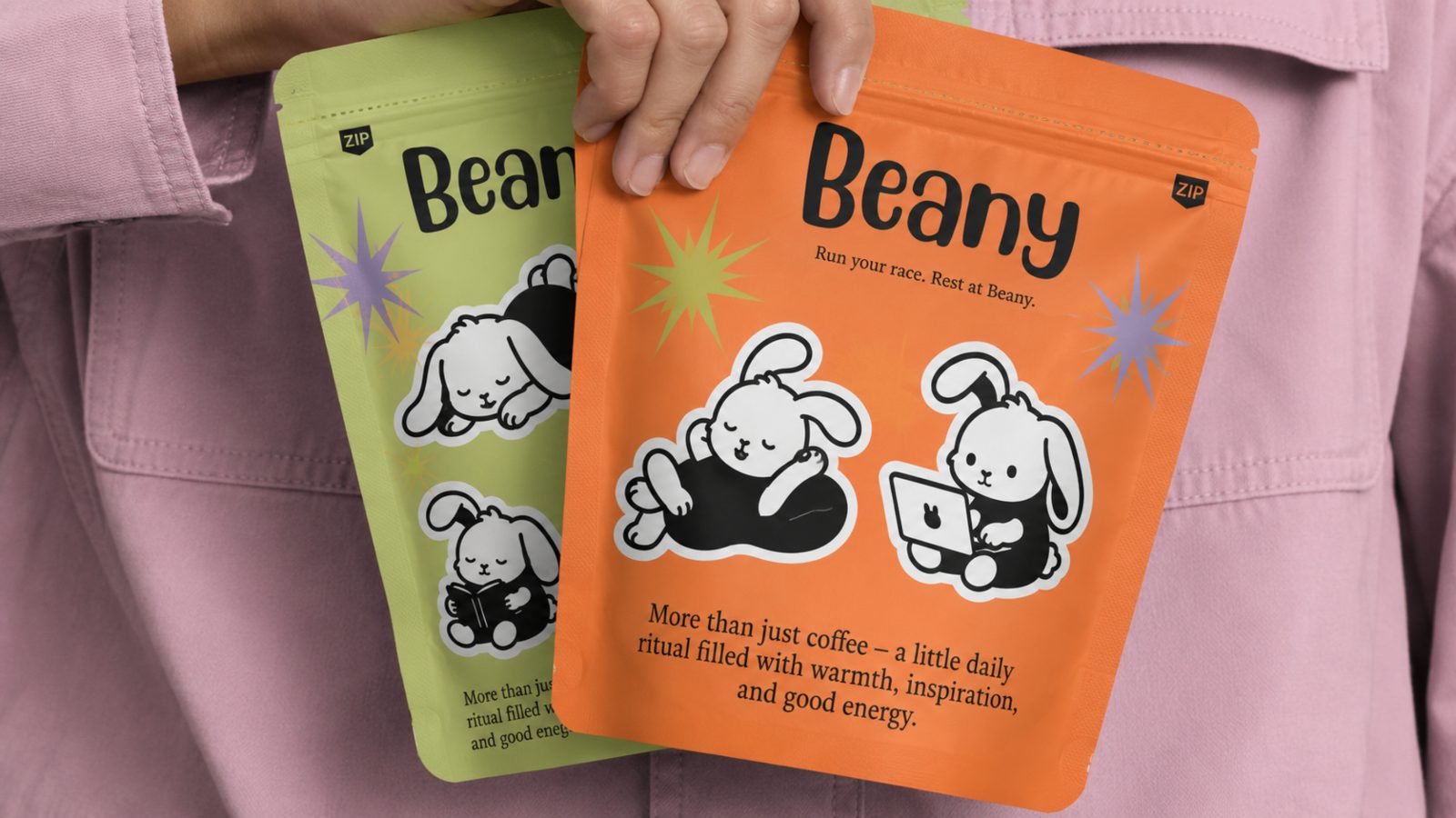
We drew the name straight into the logo. A coffee bean and a sitting bunny merge to form the B in Beany, so the wordmark and the character are the same gesture.
The bunny carries comfort and warmth. The coffee carries the ritual. Together they replace the usual coffee-shop polish with a face people actually want around.
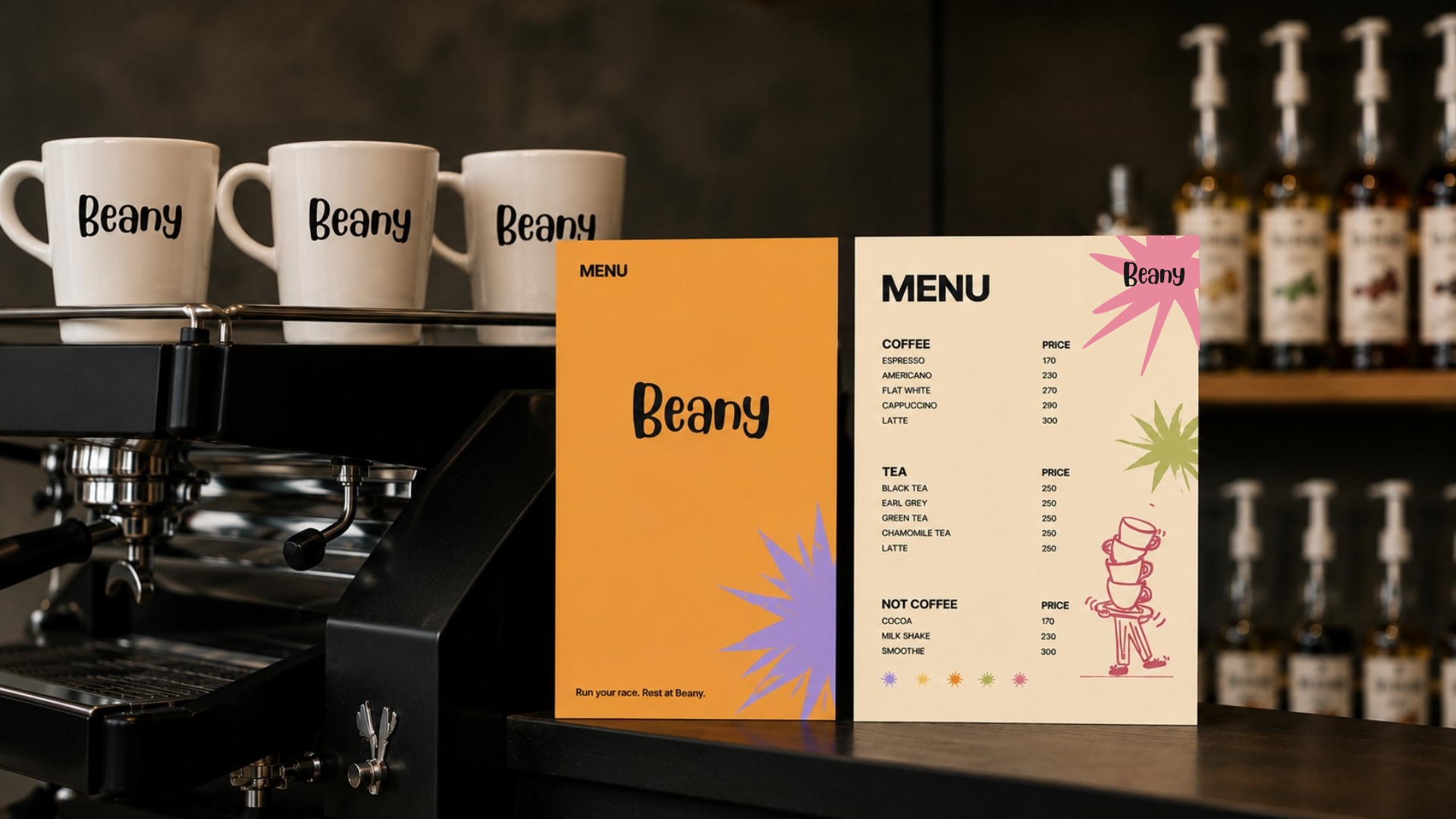
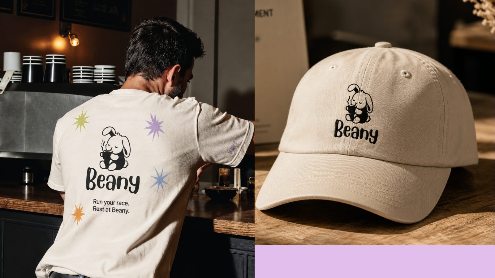
Pastel blues, greens and oranges, a rounded handmade wordmark, and a family of bunny stickers that turn up on cups, bags, flags and walls.
Approachable, comforting, and impossible to mistake for anyone else on the high street.
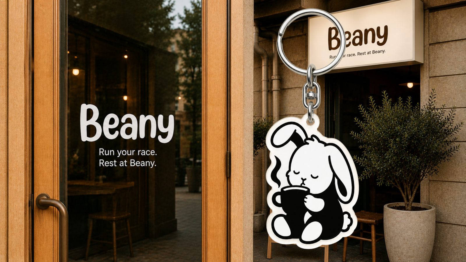
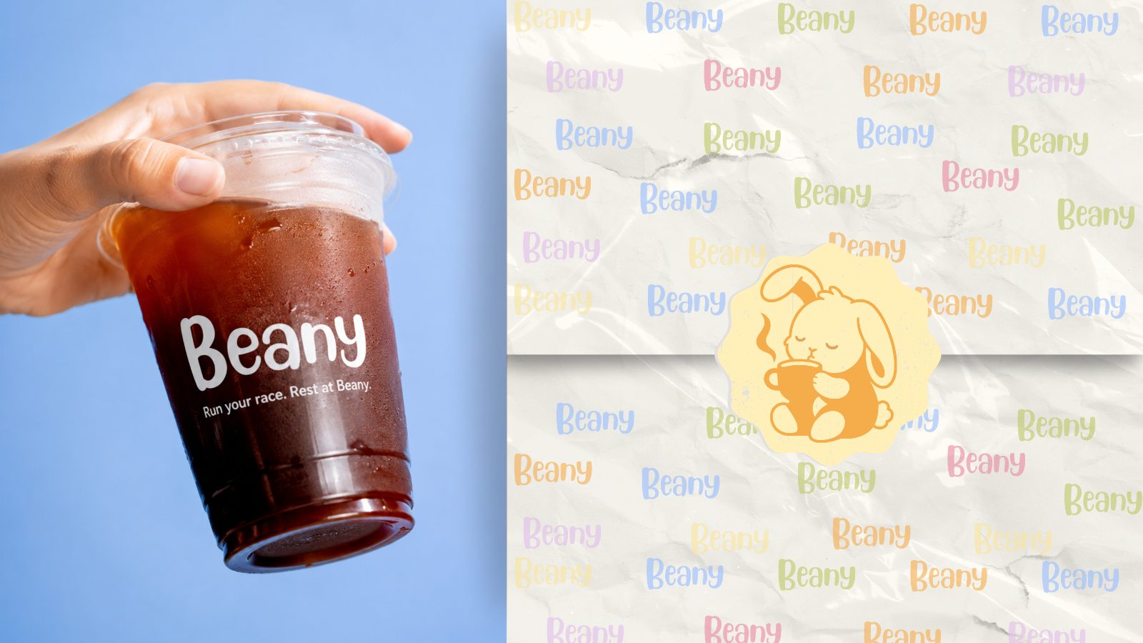
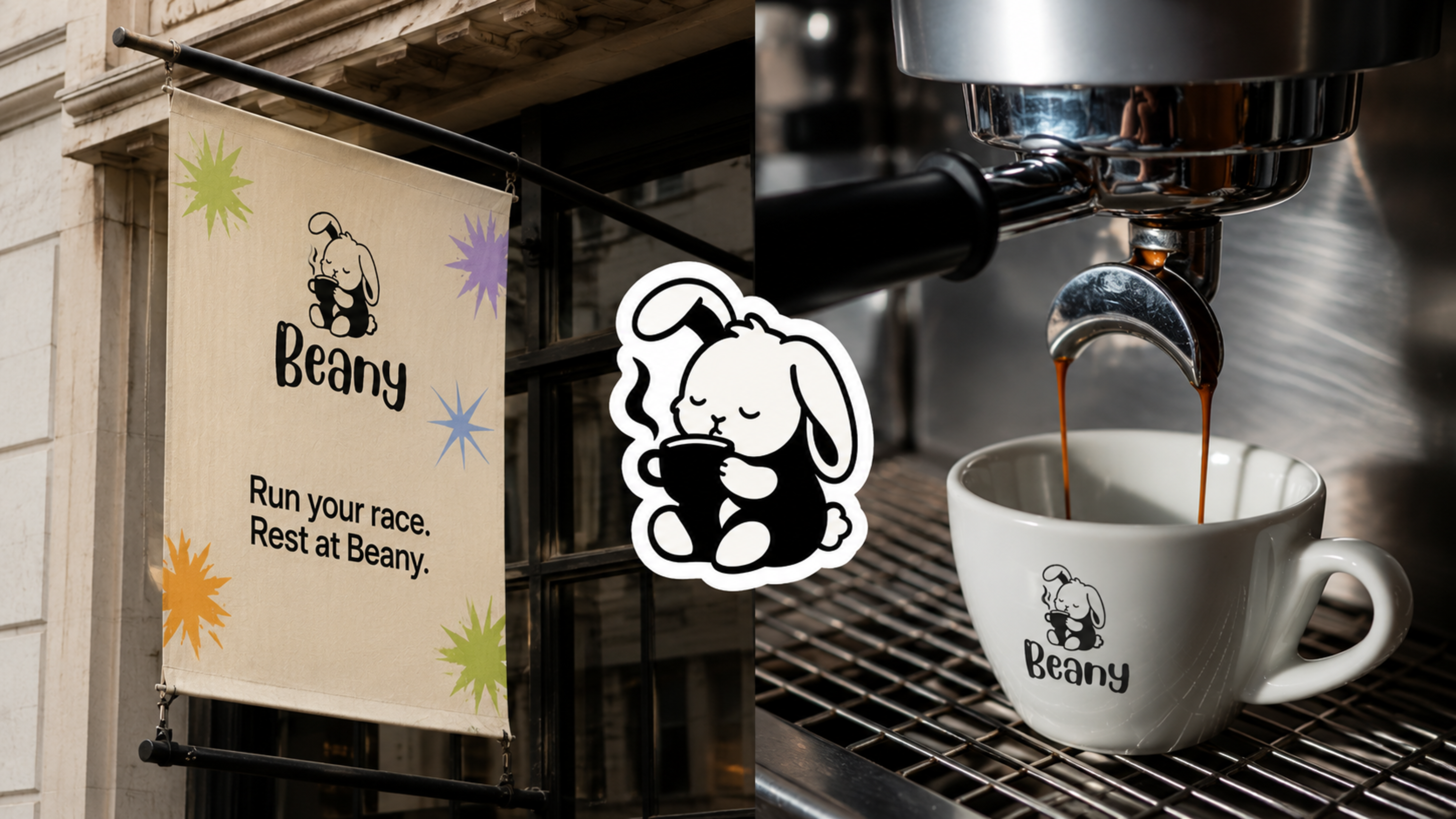
The primary lockup is a single quiet image. Eyes closed, both paws around a steaming cup, ears soft. It says the brand promise before a word is read.
It works in one colour, scales from a keychain to a storefront, and never loses the feeling of a held breath.
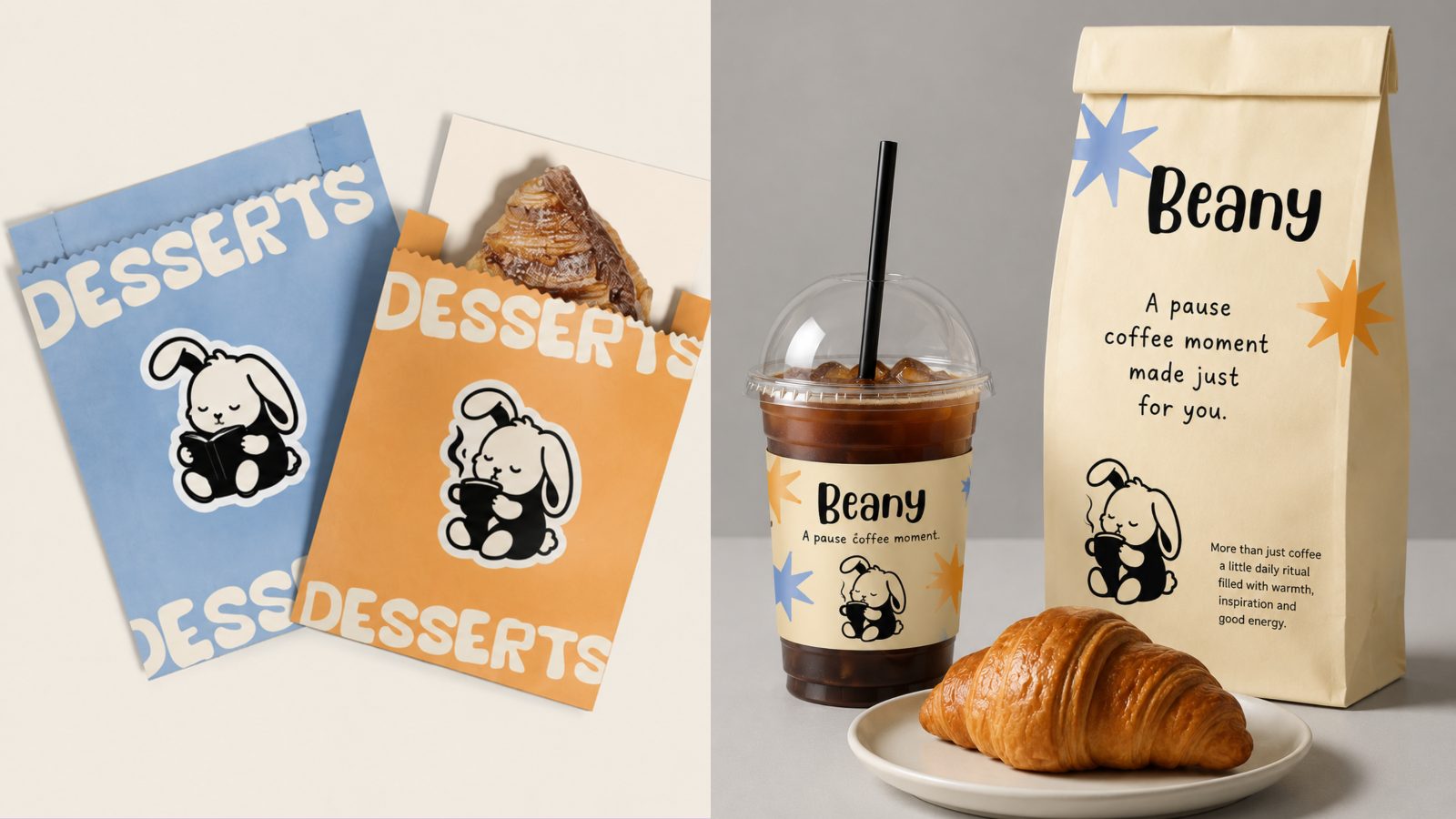
The pouch range runs in the full pastel set, each one carrying a different pair of mood bunnies and the same warm promise on the front.
Nothing on the shelf reads like a commodity. Every pack feels like a small gift from a brand that likes you.
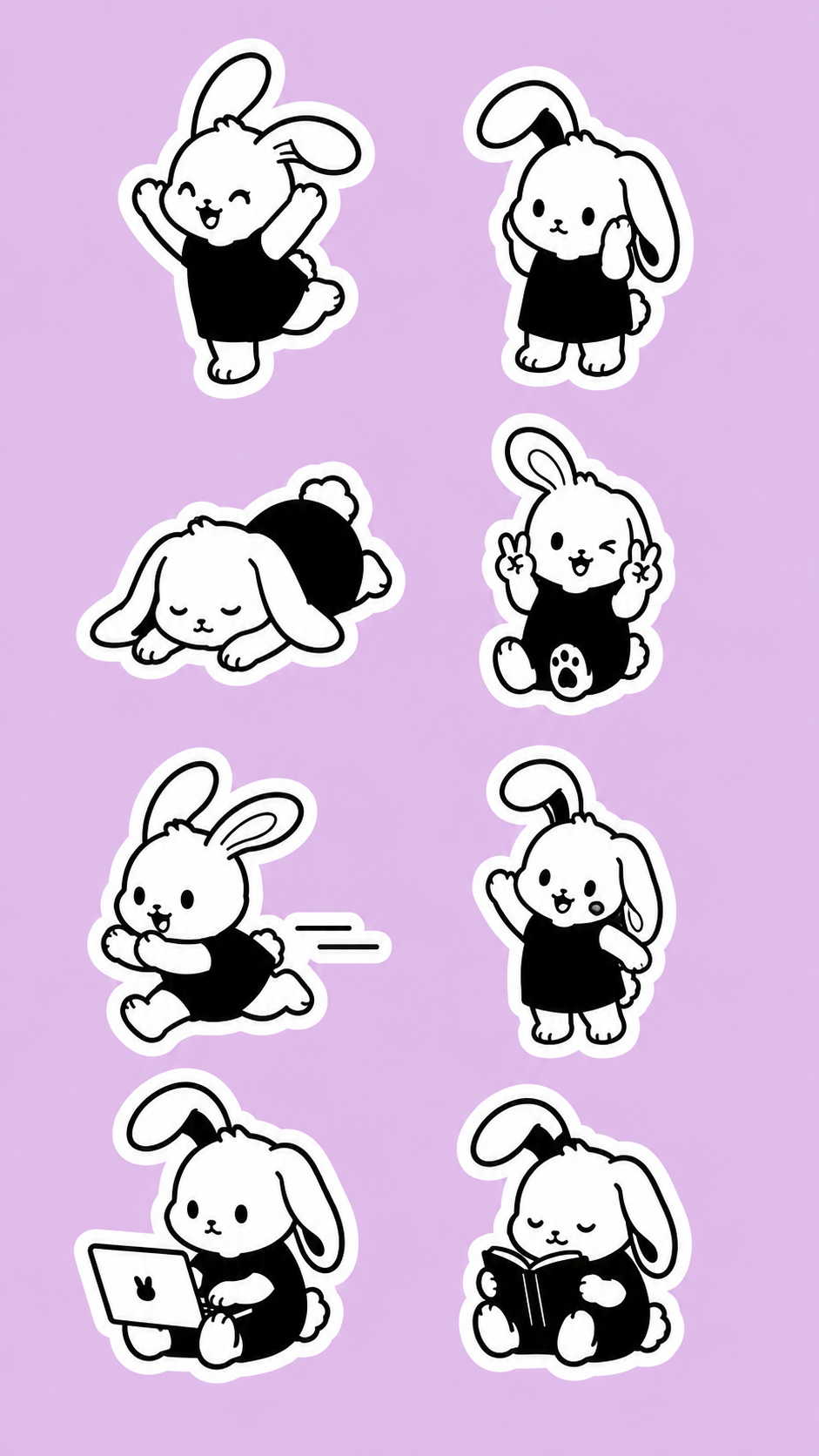
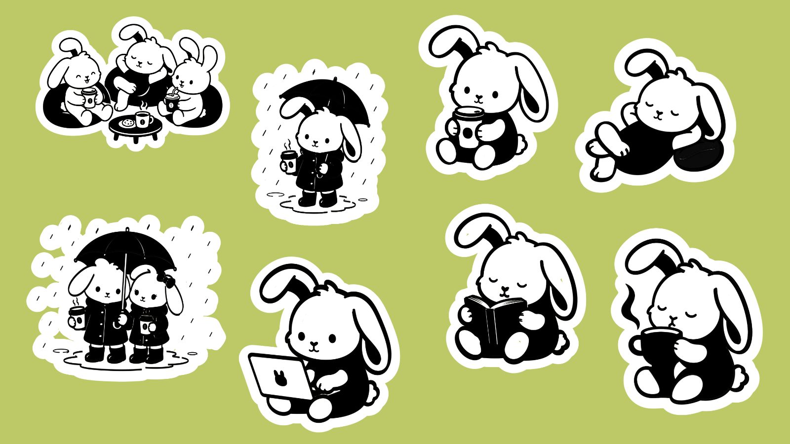
The bunny was never a single pose. It is a cast: sleepy, working, reading, dancing, sheltering from the rain with a friend. A mood for every cup and every customer.
The stickers turn packaging into a small act of self-expression, and turn customers into people who carry the brand around on purpose.
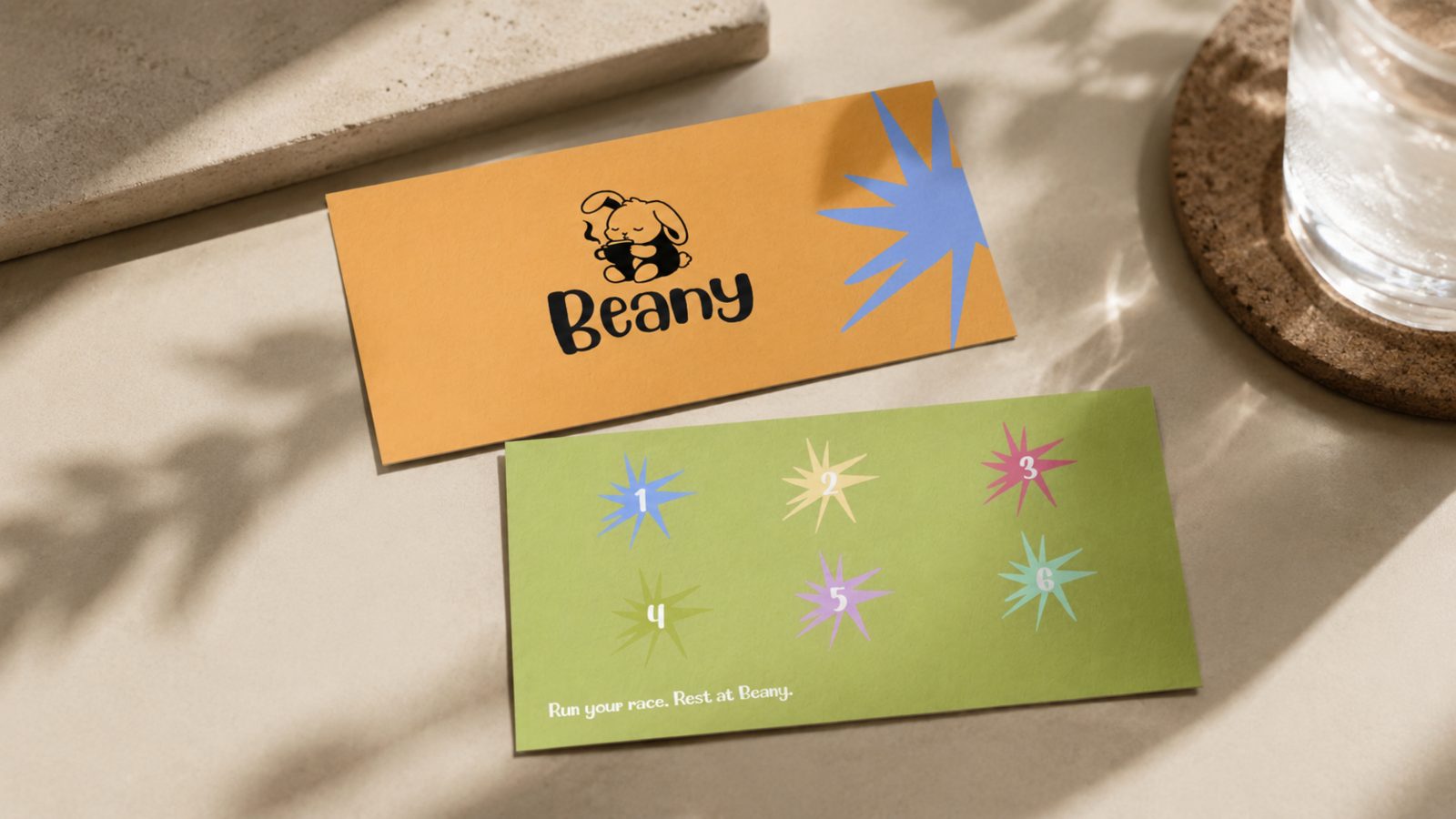
Run your race. Rest at Beany.